
Hello again, radiant readers!
It’s been a busy few months since my last post, and I have lots to share with you!
I’m so excited to announce that I was longlisted for the Templar Illustration Prize a few weeks ago… My name was officially listed within the top ten entries, which was such an incredible surprise! I unfortunately wasn’t selected in the final three shortlist, but I got so much further than I thought I would- it’s an amazing step for me as an illustrator!
A short snippet about that to begin with- it was a really interesting project to complete, we had to submit a cover design, storyboard to explore the book’s narrative and layout, and a completed artwork spread for a book about dragons aimed within the age bracket of 0-12 years. I learnt a lot during this project, and visited some pretty interesting places for research (one, a birthday trip to St. Fagan’s in Wales – to study and draw old buildings!)
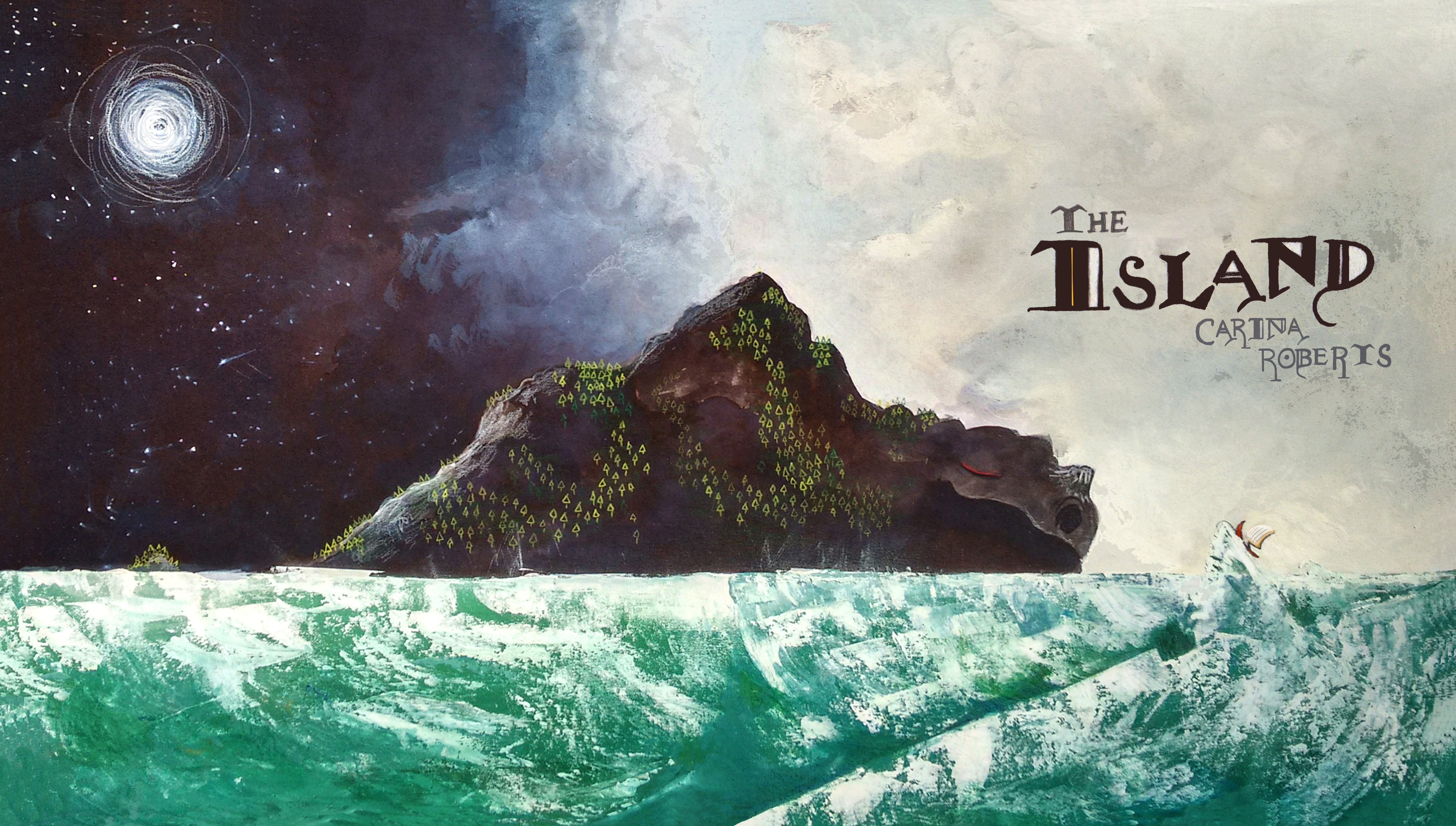
Alongside what is becoming my signature painting style of gouache and coloured pencil (with a teeny bit of ink thrown in!) I explored (and revisited) lots of different mediums and techniques to decide how to create the final artworks for this project. Bleach and lemon juice into ink to produce botanical patterns, scraping and “rock rubbing” to create texture…
At the core of this exploration was the underlying principle to simplify all elements of the final artwork which weren’t the direct focus. For example, in the cover artwork depicted above, I spent days painting sea and waves to come up with a way to make them noticeable, but not so detailed that they would distract away from the dragon floating in the middle. I needed a way to produce flowing, swirling water which could look different every time I painted it, a technique with a little bit of a mind of its own…
Then I rediscovered my Grandma’s trusty old palette knife.
I haven’t used a palette knife since the second year of university during a life-drawing lesson with oils, but I thought I’d give it a go for this project.
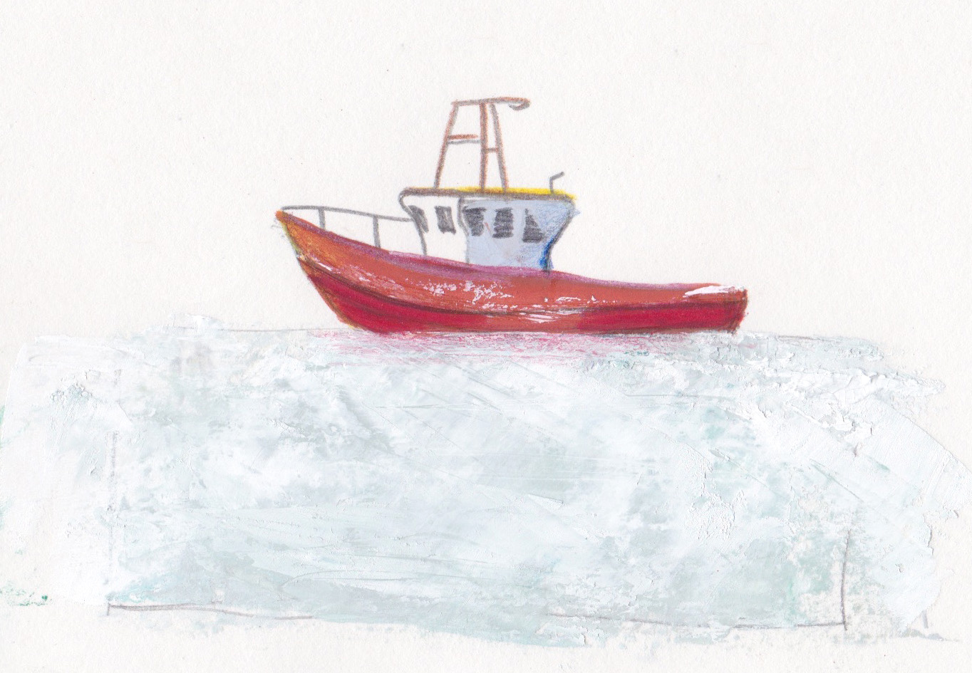
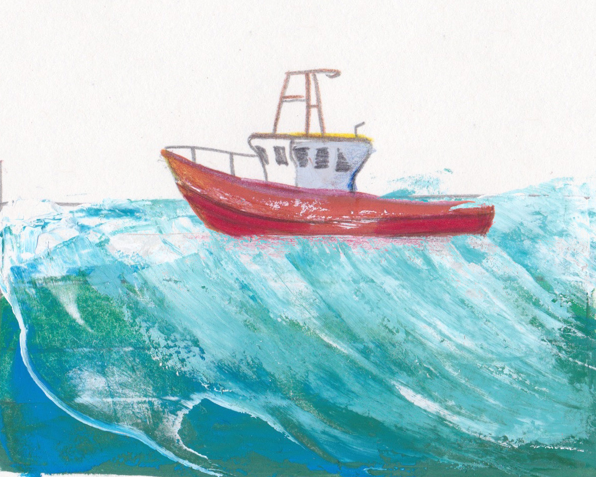
Painting stripes of pure colour onto the palette knife and dragging it across the page produced some really interesting sketchbook studies, as well as scuffing back across dried blocks of colour to create waves. (Scuffing a little paint across a very finely-textured sketchbook page can give some really interesting textures too – as I’ll explore a little later on!)
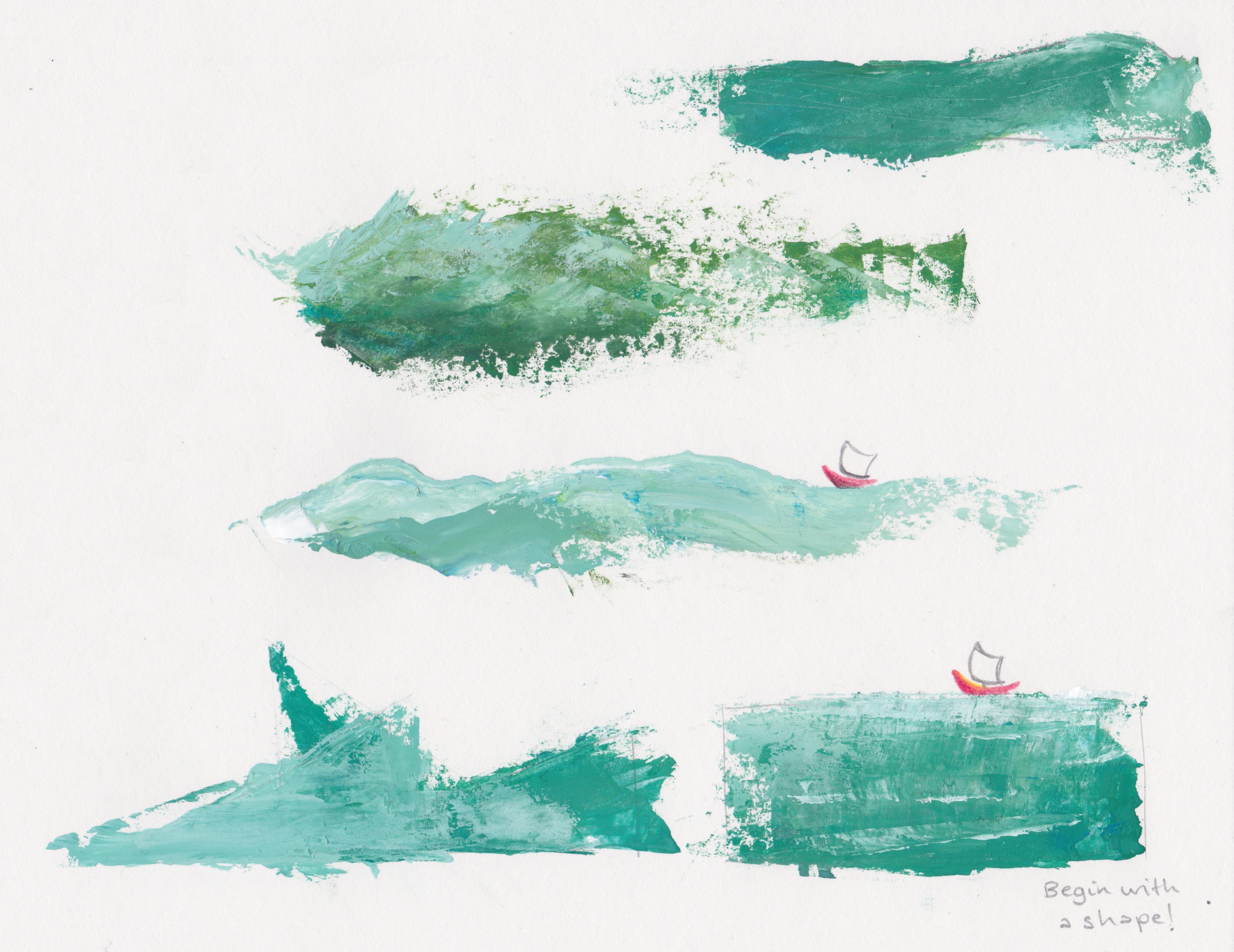
Something I’ve always shied away from when painting flowing or floaty objects without clear lines is using geometrical shapes to help build the final outcome. As the palette knife I was using has one long, tapered point, I thought I might break down some walls and attempt a rough sea constructed from triangles.
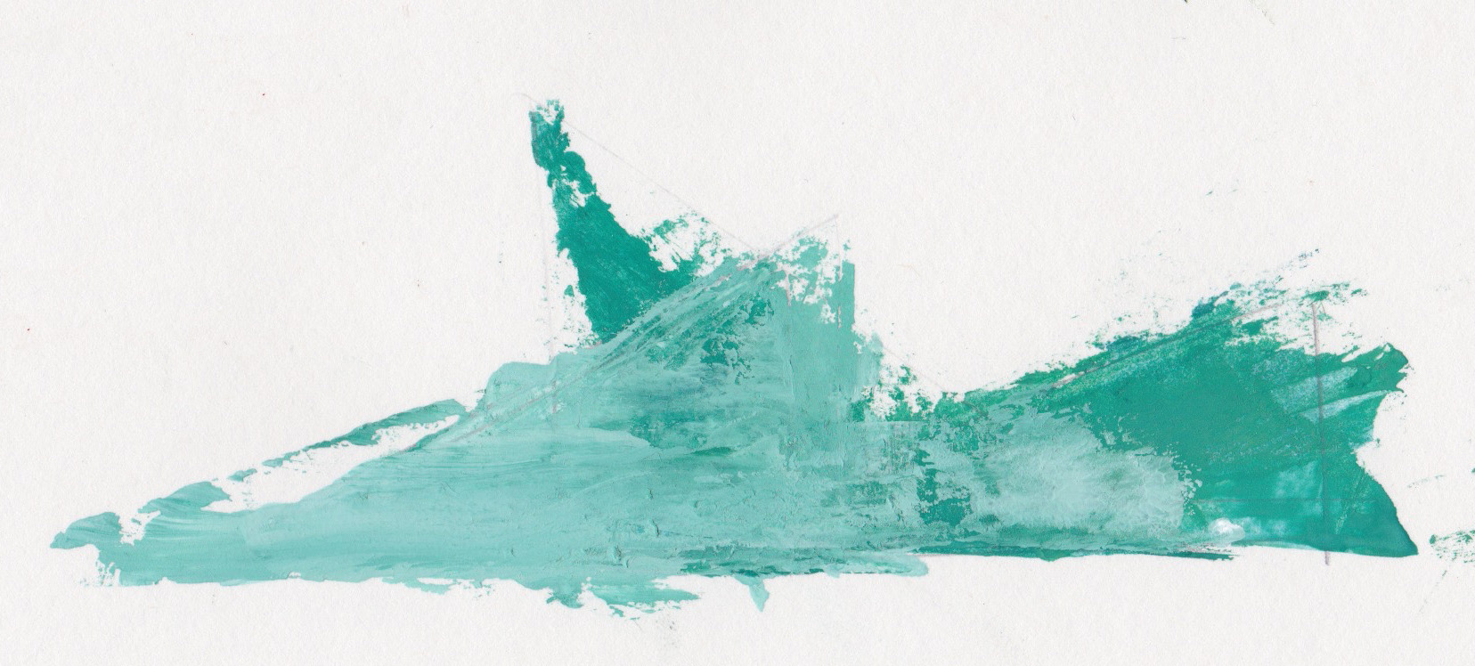
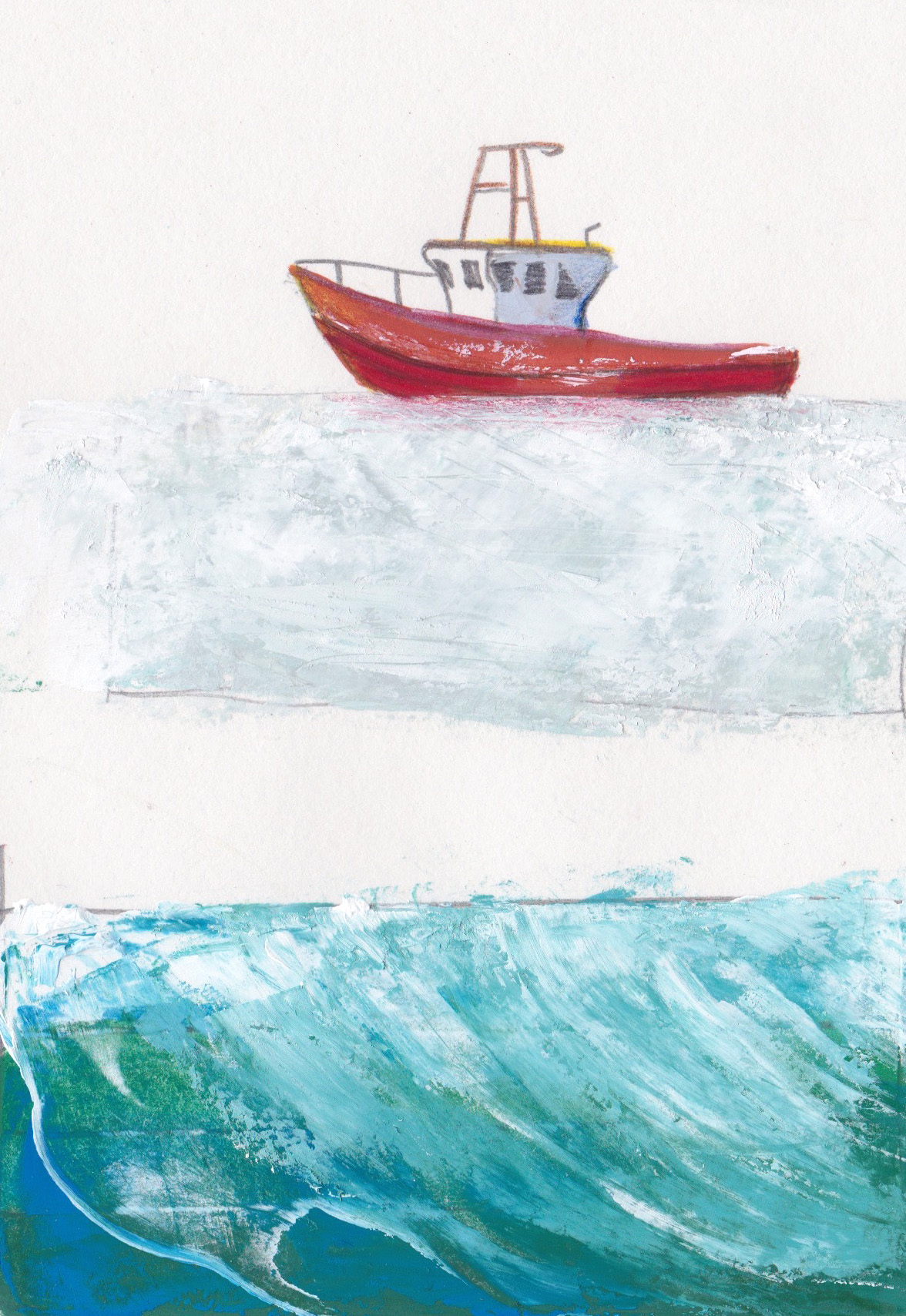
While it seemed a little alien to be be painting something which moves about so much in such a static way at first, the exercise of using triangles to create this ocean really helped me to build a sense of background and foreground, as well as liveliness in the waves. Blocking simple colour in like this allowed for more complicated processes over the top:
After this project was finished and sent off, I turned my head back to getting some Spring/Summer animal themed greetings cards designs ready for 2018. In a similar train of thought as when I was working on “The Island”, I wondered how I could use the palette knife to help bring new depth into my artwork.
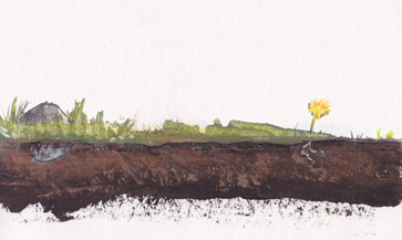
SAMPLES OF EARTH
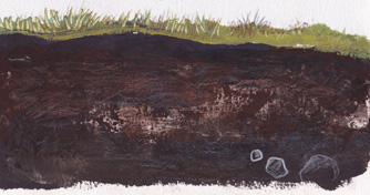
Again, the decision in using the palette knife to work out a backdrop in these greetings cards was to lend more sharpness to the foreground focus- be it animal, mineral or vegetable- equally adding some context to the main attention of the artwork, in this case a mole burrowing.
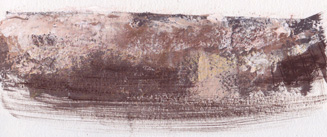
In the development stage of this particular design I used similar dragging techniques as I had when exploring the water in “The Island”, as well as loading up the palette knife with mixed colours to dab and scrape over pre-dried layers, to create bobbles, lumps and lines, as you would find in real earth.
Next, came the moles, happy burrowing in Spring through the damp earth for the juiciest earthworms!
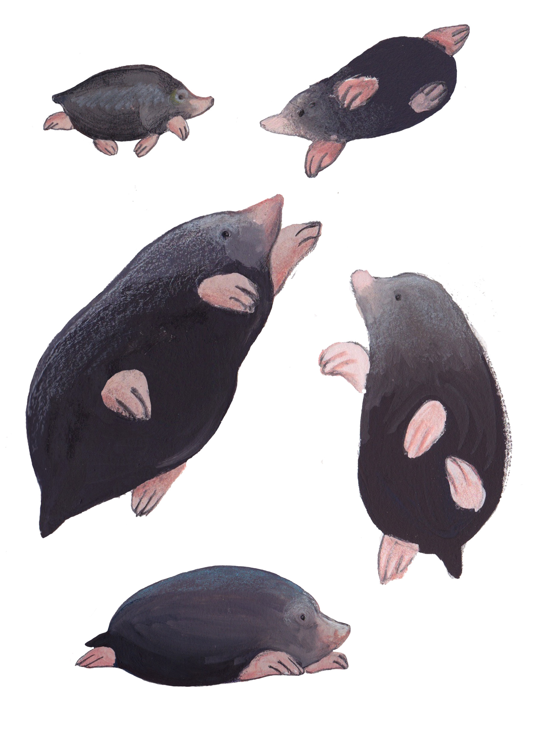
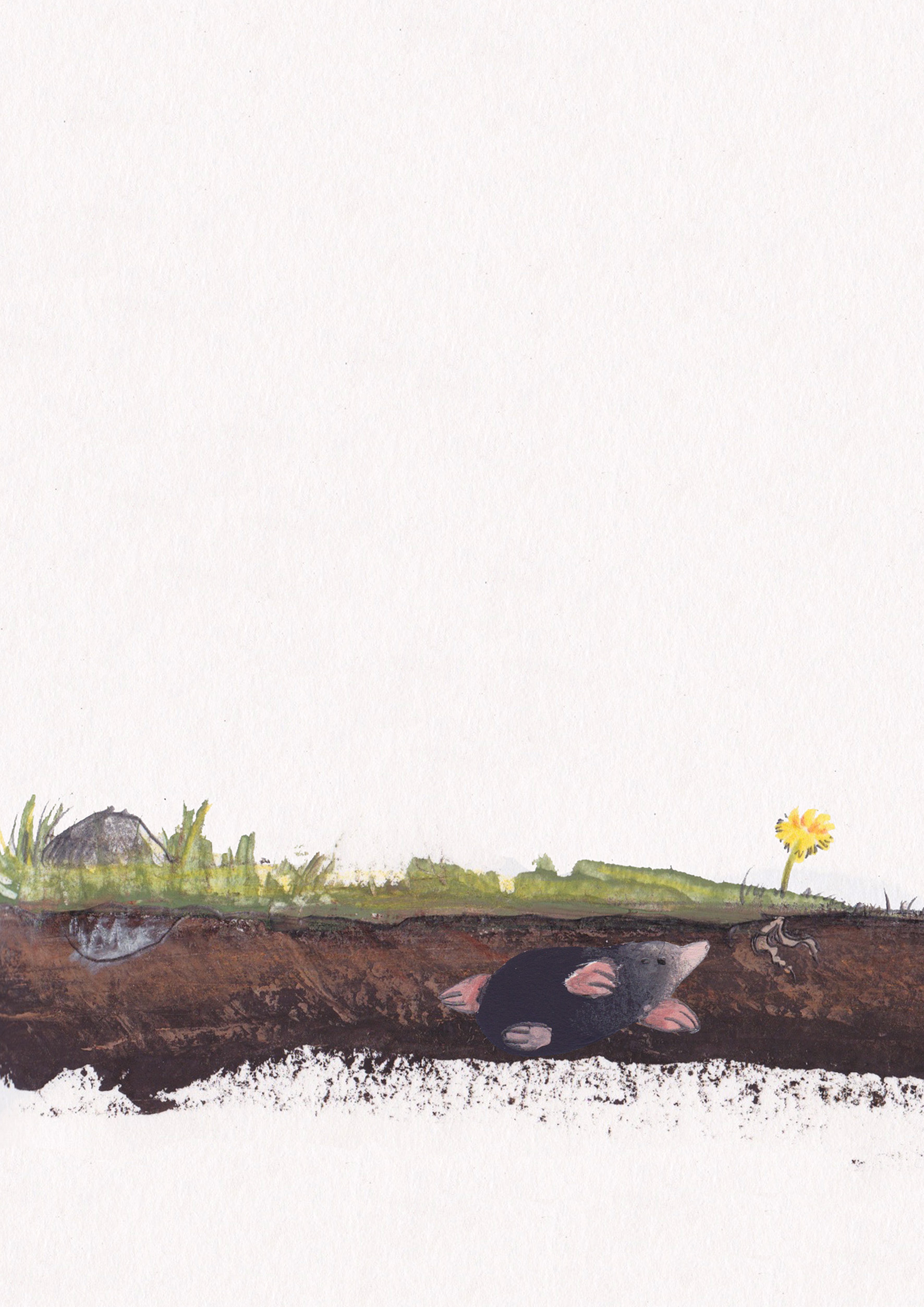
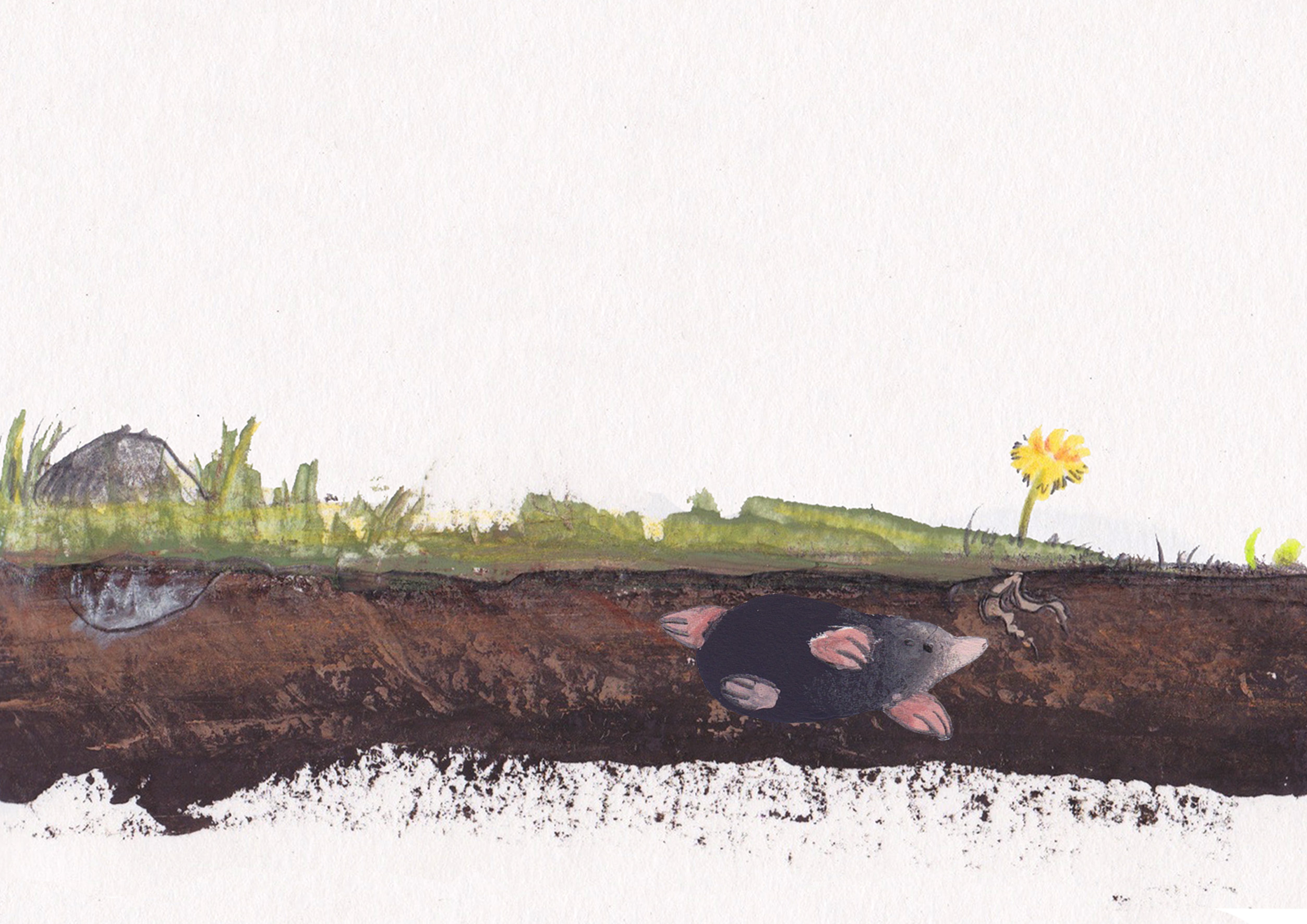
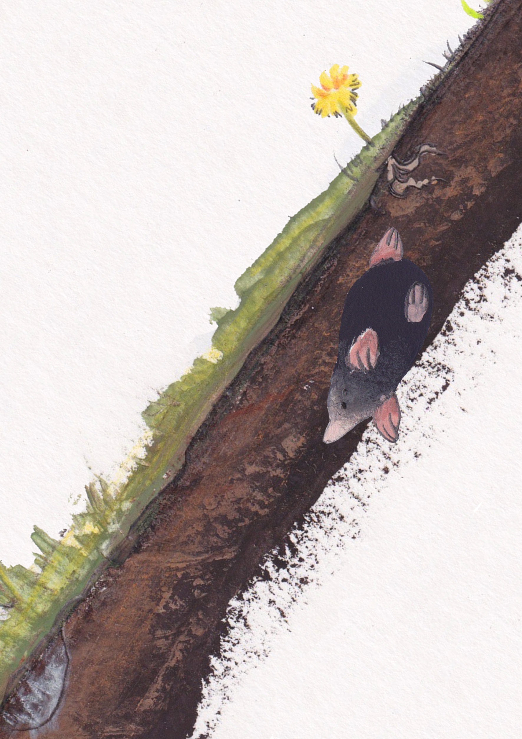
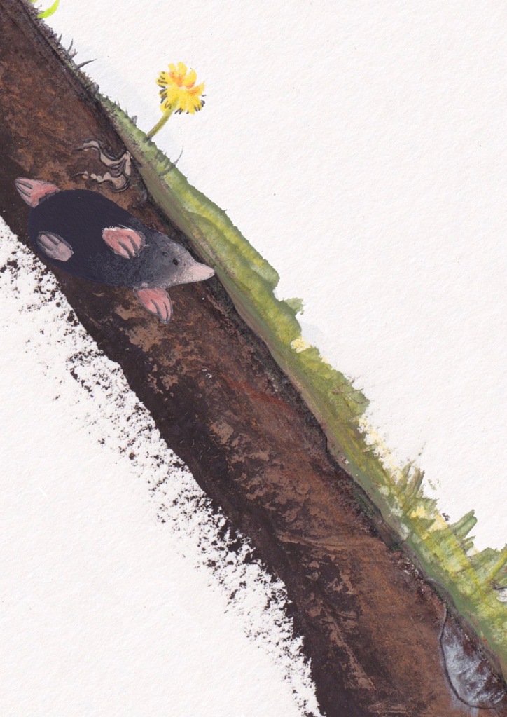
Above are some snippets from next stage of the development for this design; some of the thumbnails from working on the final layout. The palette knife scrapes began to suggest the flinging of dirt as the mole speedily dug away his tunnel, placing him firmly in his own little story. If the mole had no backdrop here, he might look a little as though he was swimming or floating through space, but having that extra layer lets him reveal to the viewer a little piece of his life. (As my skill lies mainly in narrative illustration, you can see how it seeps into all of my other projects too!)
One thing I really want to attempt next is rust- as a side-note for my silent book project I’ve begun a small sketchbook on boats as research to support a couple of the spreads, so whenever I’m in a port or seaside town I’ll be a-scribbling, with particular interest in the older behemoths which are busy oxidising and gathering sealife!
My next post will be based around an AMAZING trip to Malta, (I arrived back yesterday!) – it’s given me some really interesting ideas for my SWLA (Society of Wildlife Artists) competition entry – another little something I’ve been meaning to do in the past, which I’m really knuckling down to enter this year!
Thanks for reading- hope you’re having a great time wherever you are, and continue to find a little inspiration in every day!
The AutumnHobbit
© Carina Roberts and AutumnHobbit. Unauthorized use and/or duplication of this material without express and written permission from this blog’s author and/or owner is strictly prohibited. Excerpts and links may be used, provided that full and clear credit is given to Carina Roberts and AutumnHobbit with appropriate and specific direction to the original content.
